GoPro.com - Website Audit and Information Architecture Redesign | Case Study.
OBJECTIVE
Conduct a Content Audit of GoPro.com and through user testing, information redesign, and follow-up testing, and suggest a restructured design for the site’s Information Architecture. Using a range of programs including Excel, Photoshop, Illustrator, Optimal Workshop for tree testing and card sort tests, a proposal for redesigning the site’s main elements is presented in the end.
CONTENT AUDIT
Goal - Perform an audit of the content of GoPro.com and present Five Key Findings.
Finding #1:
Voice and Tone stay successfully consistent throughout the site, following these tone descriptors:
Enthusiastic
Casual
Friendly
Conversational
Upbeat
The Voice of GoPro
Quote taken from the GoPro mission statement, reflects the company’s consistently casual and friendly tone.
Finding #2:
Images take up too much of the screen real estate.
NN/g article “Image-focused Design: Is Bigger Better?” cites that images can have an adverse effect to information and end up distracting the user’s eye from key text elements.
GoPro’s use of scrolling is extensive and while it shows potential buyers the features of its cameras, users are likely to tire or become distracted before ever reaching the bottom of the page:
Many screens to scroll through
keep scrolling...
.
... and scrolling
more scrolling...
.... are you still there??
Finding #3:
Important information isn’t kept at the top of the page, where viewers are more likely ro read it. Instead, there is an extensive length of scrolling real estate to cover, and information is scattered throughout the scroll. (see example above)
Citing NN/g’s article “Above the Fold”, providing key information to the site visitor could be simplified by containing it better at the top of the page and using fewer large photos that require scrolling through.
Finding #4:
There’s a single use of parallax scrolling in an otherwise repeated use of fixed long scrolling in navigation. It's jarring and confuses the users.
Finding #5:
Accessibility in videos rarely exists or is erratic and not in English.
According to the Web Content Accessibility Guidelines (WCAG) W3C Guideline #1, designers should “provide equivalent alternatives to auditory and visual content.”
Conclusion
These findings point out where GoPro is doing well, as well as some areas it could improve upon its design to better serve its customers.
Pros:
Huge social media following.
Great video content (both user-generated and professional).
Voice is very consistent throughout site and reflects founder Nick Woodman’s voice.
Cons:
Flow inconsistencies.
Pare down images to fewer, keeping the key information at top of each page
Accessibility should be better (subtitles in video content)
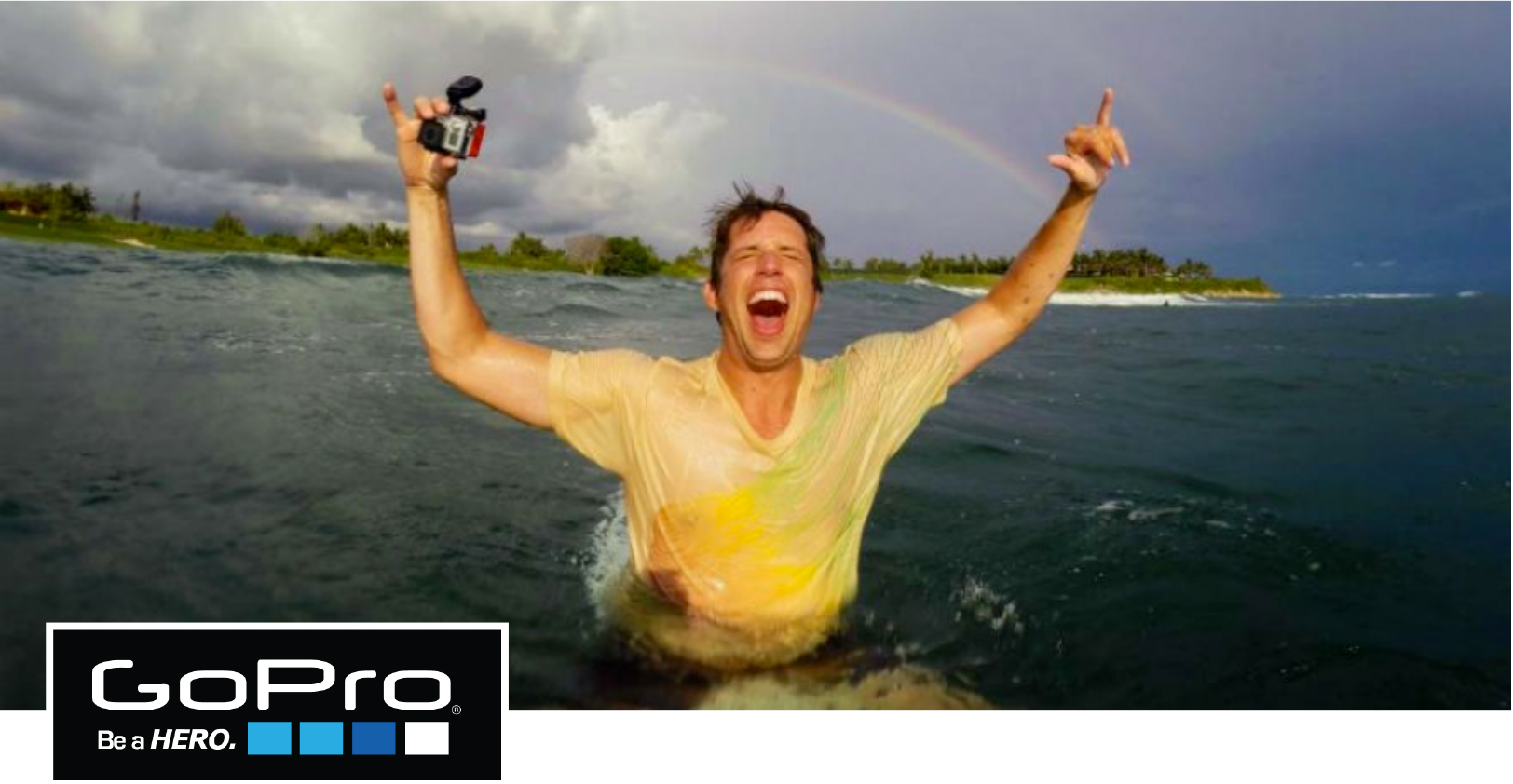
Advertisement banner from GoPro website
Information Architecture Makeover
Goal - Test the current structure of GoPro.com with users and learn whether the site’s architecture is the best it can be. Learn this by testing various elements with participants and provide visual guides to suggest a better design for the GoPro website architecture.
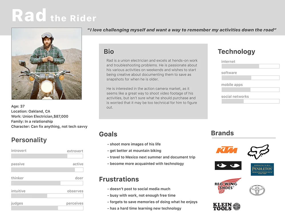
Who is the GoPro customer?
Sending out a survey to a number of GoPro users, information was compiled about their lifestyle habits and goals. Taking this feedback and selecting similar patterns, a primary persona was built from this information.
How successful is the informational structure of the current site?
The next step was to create a study of the current site organization. A Tree Test study was created to determine how well participant completed tasks under the current site architecture. Some interesting insights were discovered:
Participants clicked on “PLUS”, not realizing it leads to a monthly membership service.
The menu link “Watch” was wrongly clicked a number of times.
Tech Specs were hard to find, and no users could discover whether one camera was waterproof or not.
100% of test subjects wrongly expected to find product specs in the same place where the product is listed for sale.
30% of users looked under camera models to find whether they are compatible with the GoPro Karma drone. This isn’t where that information currently is.
Users looked in a variety of wrong places to look for replacement parts.
Test the current labeling system using a Card Sort test.
The next step was to take a study of the current site organization. A Card Sort test was created, to see how participants felt the structure was and labels should be organized.
Remove “Watch”, consider renaming it “Videos”, or tying into a larger GoPro culture area.
Remove the label “PLUS”, perhaps create an icon for the membership service.
Remove “Shop”, have each item listed, with a clear Call To Action for purchasing.
Use “Cameras” as label for HERO Products (which are cameras).
Put “Support” in an easy to find location.
Keep “Apps” also in an easy to find location.
Users looked in a variety of wrong places to locate replacement parts.
With this information noted, the next stage was to revise the sitemap and begin imagining a new structure for a more intuitive site flow:
Add “Support” in the global navigation. Include in it a Search, Product Manuals, Software Updates, and Tech Specs.
Divide Shop into Cameras and Drones. Include Karma drone and Karma Grip stabilization at top.
Link each product page to submenu support items for that product.
Create “Community” as a section in the global nav, include as sub-catagories About Us, Videos, Contests.
Testing the next iteration.
With the new structure re-written, a second Tree Test was sent out to participants. The results showed that the features, product support, and tutorials were now much easier to find, being now in the same field as the product. However, some of the video watching items were still hard to find, under the label “Community”, so that is an area to revisit more in the future.
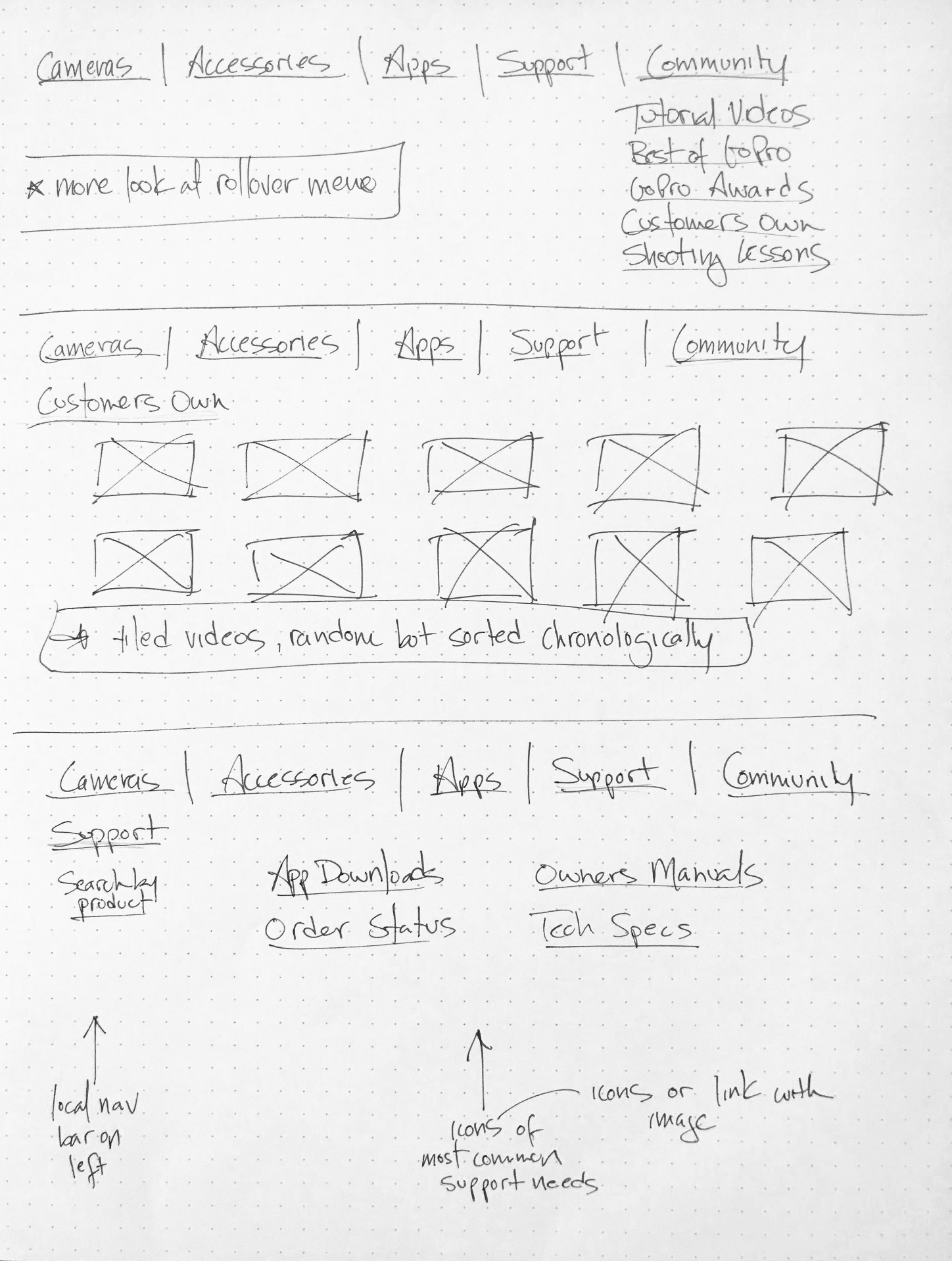
Sketches and lo-fi wireframes
The final portion of this project was to end with making sketches of a new framework, and experiment with different elements of showing the new organization and labelling.
Final design: Initial lo-fi wireframes
The last step in this case study was to rewrite the structure into a set of wireframes. The following UI elements were things that were incorporated into the new design:
Use a left-side global navigation bar, with a pop-out menu for secondary items.
For the tertiary menu items, keep a static top menu, allowing users to easily switch between the topics.
The site will still have scroll-down pages, but with fewer images and less scrollable distance. Key features will be highlights more at the top of the page.
Embedded videos will play a key part of grabbing the users’ attention. As videos are a key part of the GoPro brand, they could be used to highlight the GoPro culture.
Conclusion
The goal of GoPro is to sell cameras and promote their culture through customers advocating the GoPro product. Predictably, the website is rich in visual content and the voice of the content speaks consistently throughout. It starts to fall apart when showcasing some of its information and visitors may be missing opportunities to learn valuable information.
Along with the product features, consider including product Manuals, Tech Specs, Parts, user Tutorials and product Support. In addition, since culture is such an important part of the company, create a Community area where content is shared and tutorials can be watched and people can learn more about GoPro’s causes, contests and view social media posts.


